 热门城市
热门城市


- 快召唤伙伴们来围观吧
- 微博 QQ QQ空间 贴吧
- 文档嵌入链接
- <iframe src="https://www.slidestalk.com/u70/BootstrapGridSystem2017?embed" frame border="0" width="640" height="360" scrolling="no" allowfullscreen="true">复制
- 微信扫一扫分享
Bootstrap Grid System 2017
分享
点赞
9
收藏
2
下载 1
深入介绍Twitter的Boostrap框架中的网格系统,介绍了boostrap的基本结构,网格系统怎么规划,以及怎么使用boostrap来定,文末还提供了boostrap的各种主题。
展开查看详情
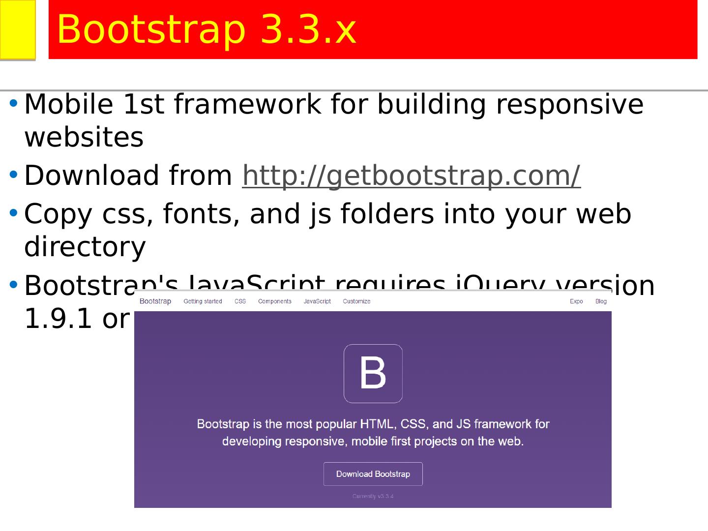
1 .Twitter Bootstrap Grid System Medhat Elmasry http://china2017.zift.ca/
2 .Twitter Bootstrap Grid System Medhat Elmasry http://china2017.zift.ca/
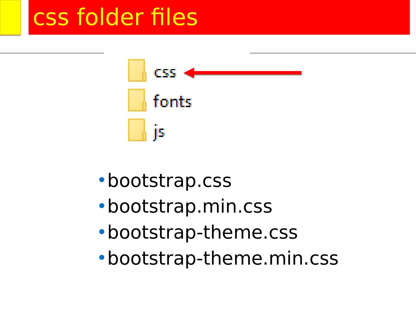
3 .bootstrap.css bootstrap.min.css bootstrap-theme.css bootstrap-theme.min.css css folder files
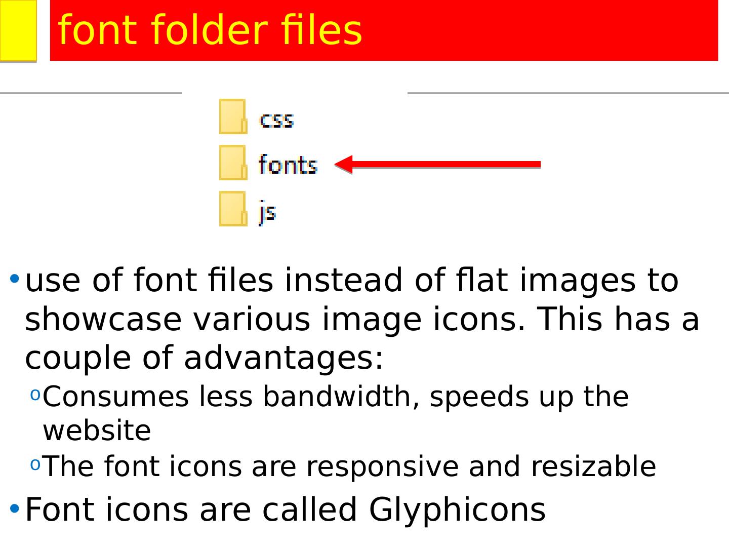
4 .use of font files instead of flat images to showcase various image icons. This has a couple of advantages: Consumes less bandwidth, speeds up the website The font icons are responsive and resizable Font icons are called Glyphicons font folder files
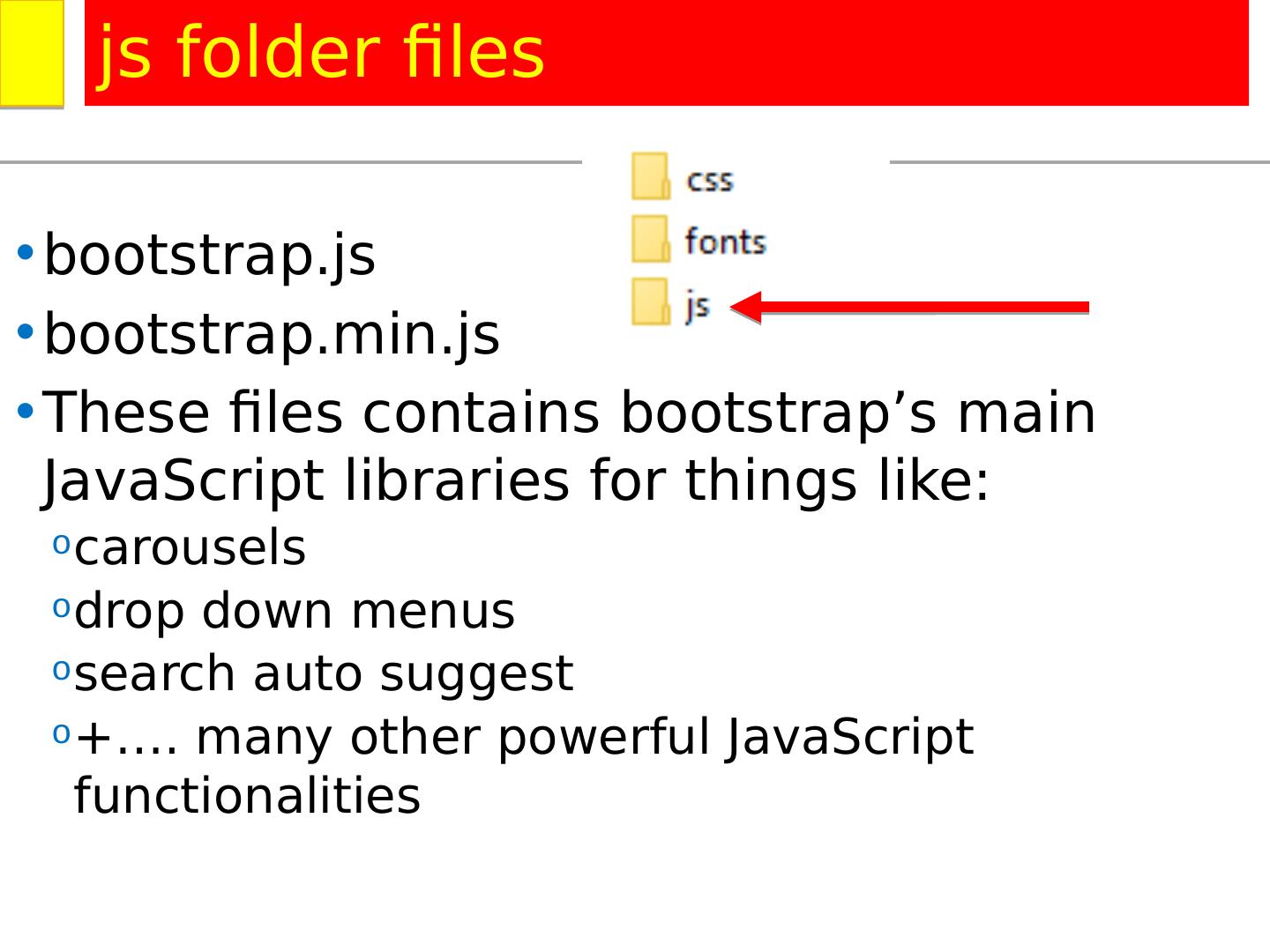
5 .bootstrap.js bootstrap.min.js These files contains bootstrap’s main JavaScript libraries for things like: carousels drop down menus search auto suggest +…. many other powerful JavaScript functionalities js folder files
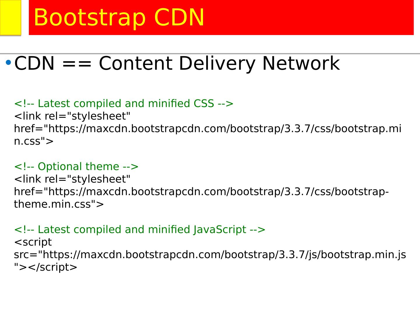
6 .CDN == Content Delivery Network Bootstrap CDN http://www.asp.net/ajax/cdn <!-- Latest compiled and minified CSS --> <link rel ="stylesheet" href ="https:// maxcdn.bootstrapcdn.com/bootstrap/3.3.7/ css /bootstrap.min.css "> <!-- Optional theme --> <link rel ="stylesheet" href ="https:// maxcdn.bootstrapcdn.com/bootstrap/3.3.7/ css /bootstrap-theme.min.css "> <!-- Latest compiled and minified JavaScript --> <script src ="https:// maxcdn.bootstrapcdn.com/bootstrap/3.3.7/ js /bootstrap.min.js "></script>
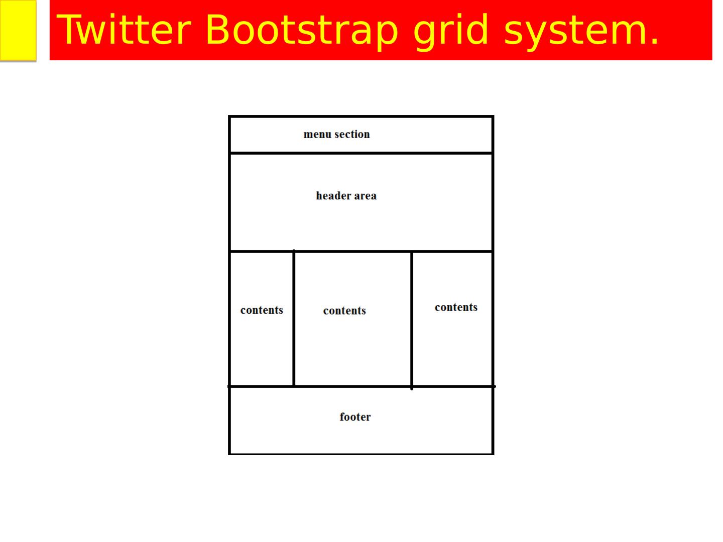
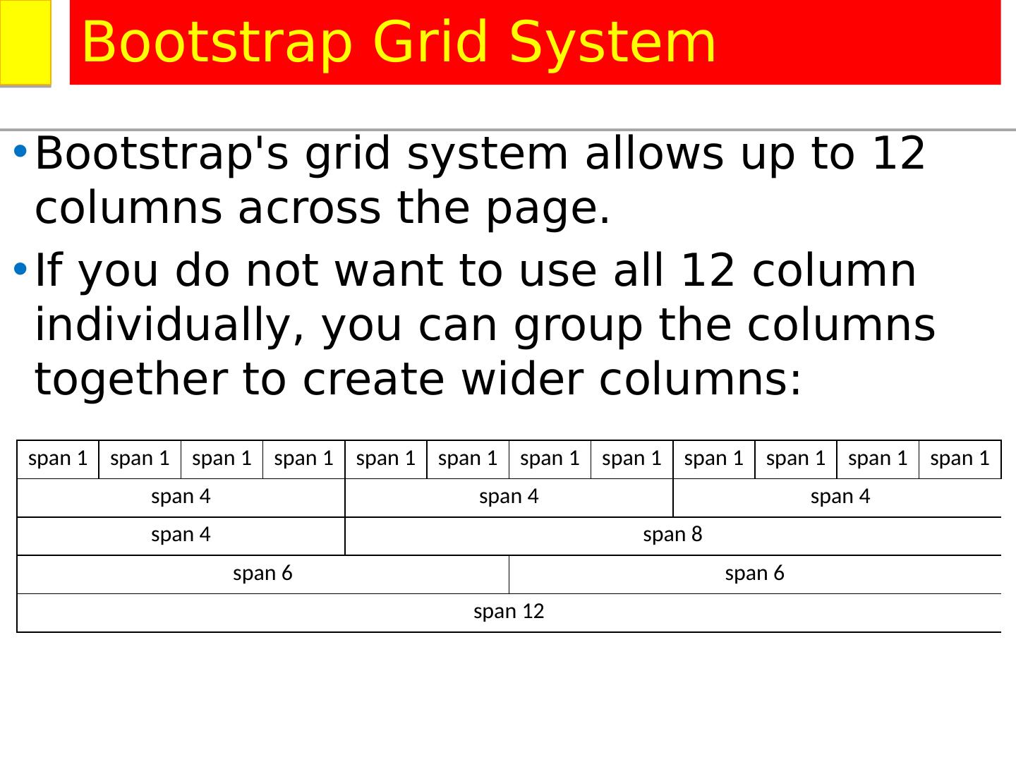
7 .Twitter Bootstrap grid system.
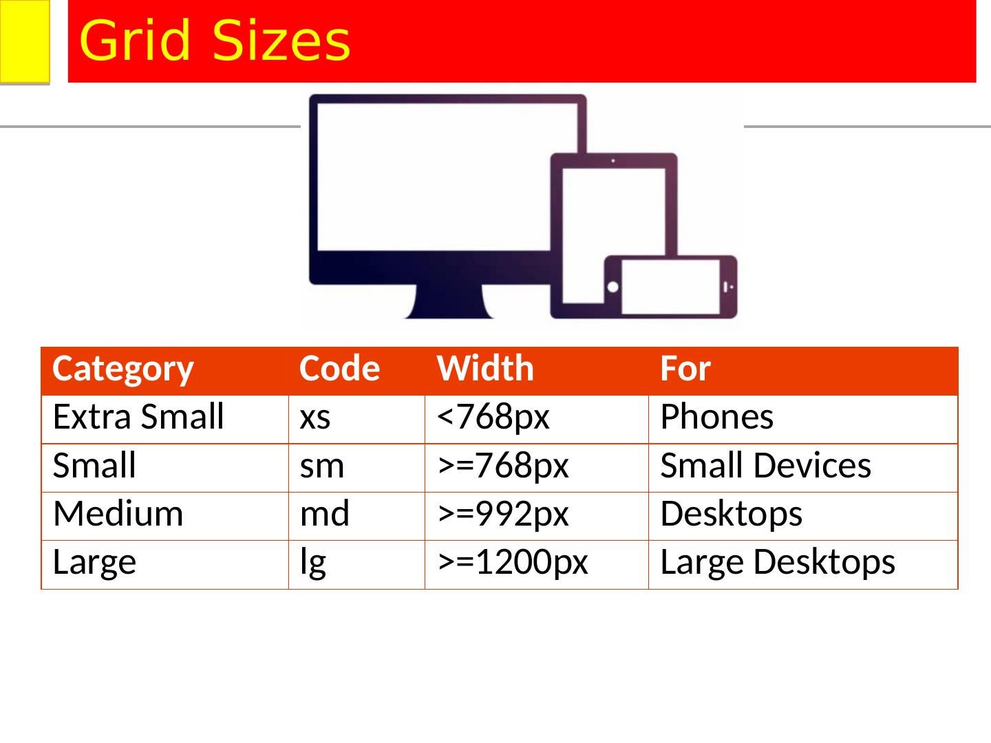
8 .Category Code Width For Extra Small xs <768px Phones Small sm >=768px Small Devices Medium md >=992px Desktops Large lg >=1200px Large Desktops Grid Sizes
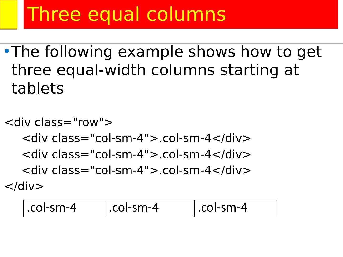
9 .The following example shows how to get three equal-width columns starting at tablets < div class="row"> < div class="col-sm-4">.col-sm-4</div> < div class="col-sm-4">.col-sm-4</div> < div class="col-sm-4">.col-sm-4</div> </div > Three equal columns .col-sm-4 .col-sm-4 .col-sm-4
10 .The following example shows how to get three equal-width columns starting at tablets < div class="row"> < div class="col-sm-4">.col-sm-4</div> < div class="col-sm-4">.col-sm-4</div> < div class="col-sm-4">.col-sm-4</div> </div > Three equal columns .col-sm-4 .col-sm-4 .col-sm-4
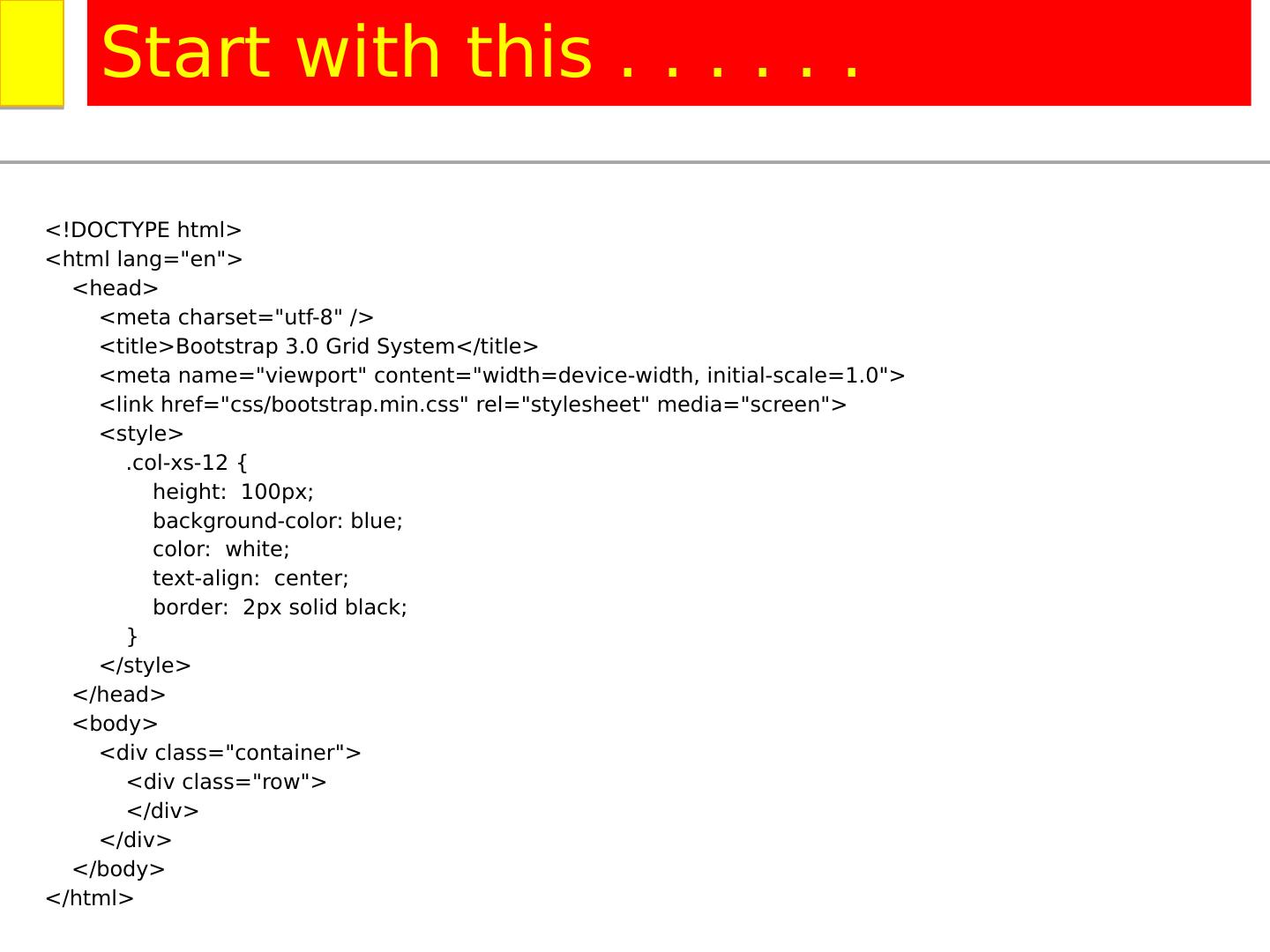
11 .<!DOCTYPE html> <html lang =" en "> <head> <meta charset="utf-8" /> <title>Bootstrap 3.0 Grid System</title> <meta name="viewport" content="width=device-width, initial-scale=1.0"> <link href =" css /bootstrap.min.css" rel =" stylesheet " media="screen"> <style> .col-xs-12 { height: 100px; background-color: blue; color: white; text-align: center; border: 2px solid black; } </style> </head> <body> <div class="container"> <div class="row"> </div> </div> </body> </html> Start with this . . . . . .
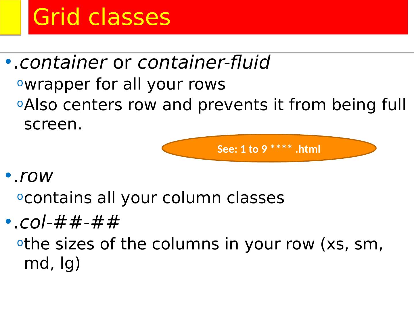
12 ..container or container-fluid wrapper for all your rows Also centers row and prevents it from being full screen. .row contains all your column classes .col-##-## the sizes of the columns in your row ( xs , sm , md, lg ) Grid classes See: 1 to 9 **** .html
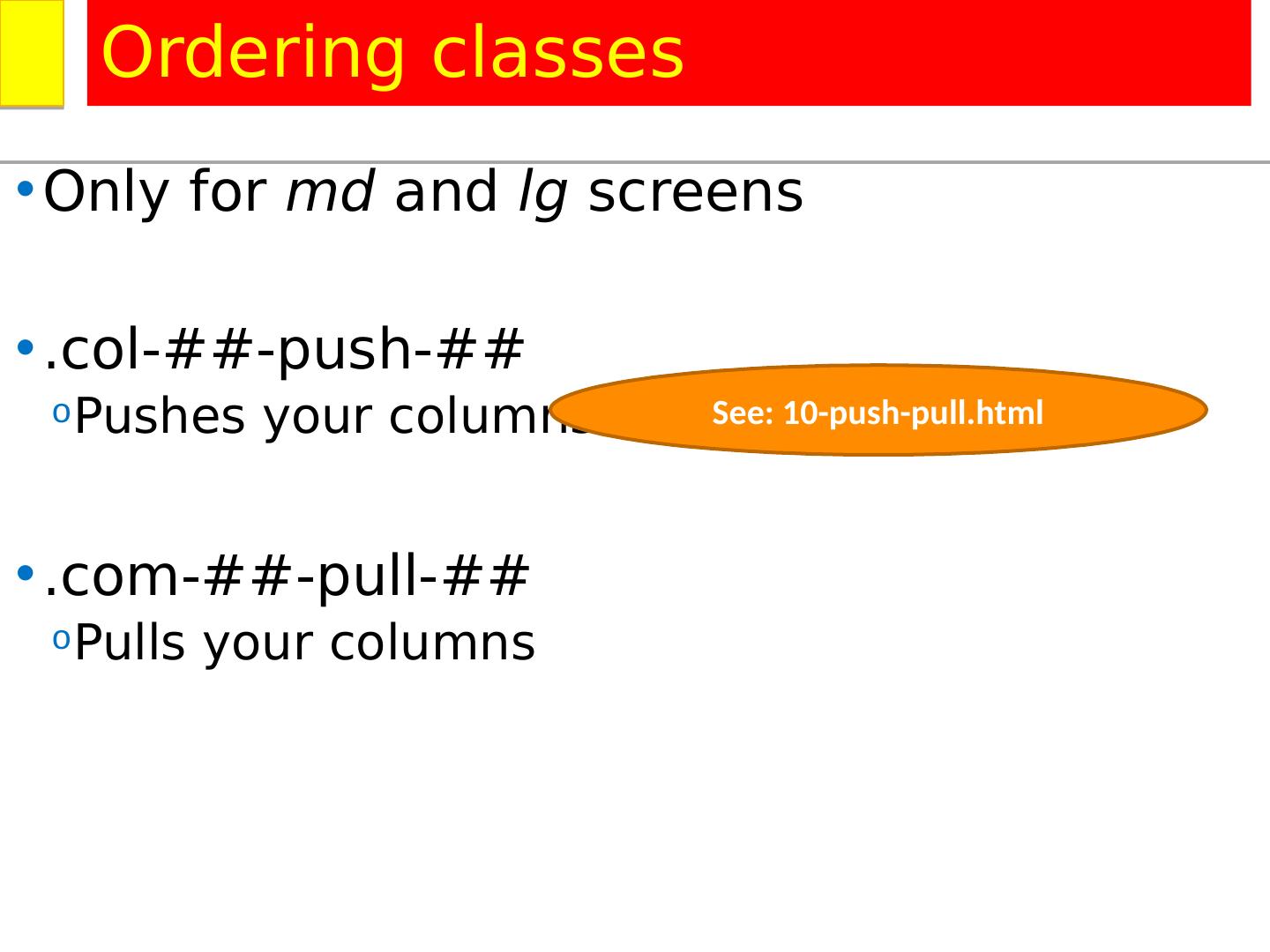
13 .Only for md and lg screens .col-##-push-## Pushes your columns .com-##-pull-## Pulls your columns Ordering classes See: 10-push-pull.html
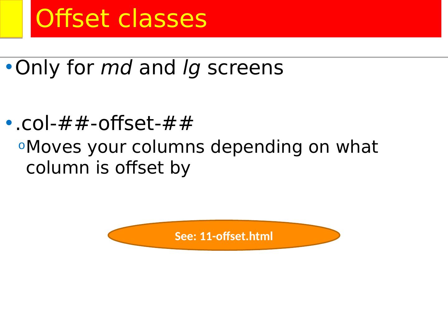
14 .Only for md and lg screens .col-##-offset-## Moves your columns depending on what column is offset by Offset classes See: 11-offset.html
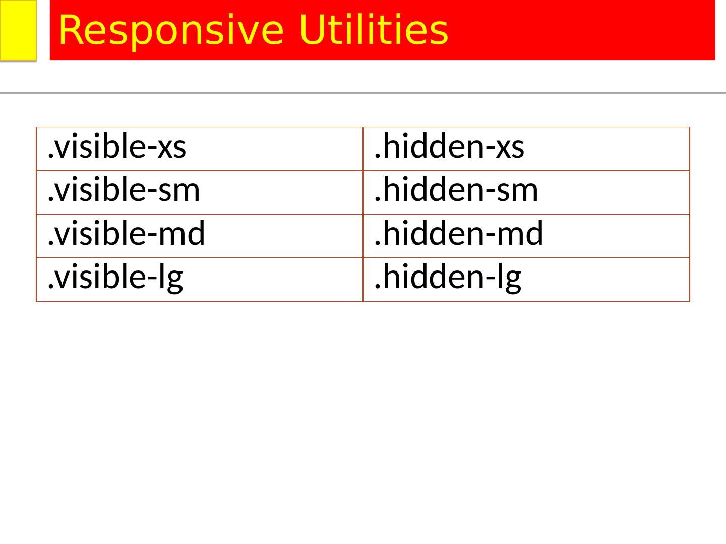
15 ..visible- xs .hidden- xs .visible- sm .hidden- sm .visible-md .hidden-md .visible- lg .hidden- lg Responsive Utilities
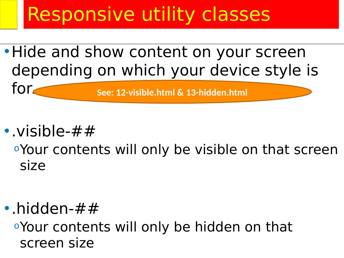
16 .Hide and show content on your screen depending on which your device style is for. .visible-## Your contents will only be visible on that screen size .hidden-## Your contents will only be hidden on that screen size Responsive utility classes See: 12-visible.html & 13-hidden.html
17 .<table class="table table-condensed table-striped table-hover"> <caption>Months of the year</caption> < thead > < tr > < th >Month</ th > < th >Days</ th > </ tr > </ thead > < tbody > < tr class="danger"> <td>January</td> <td>31</td> </ tr > < tr class="active"> <td>February</td> <td>28<span class="text-danger">*</span></td> </ tr > < tr class="success"> <td>March</td> <td>31</td> </ tr > Styling tables See: 14-table.html
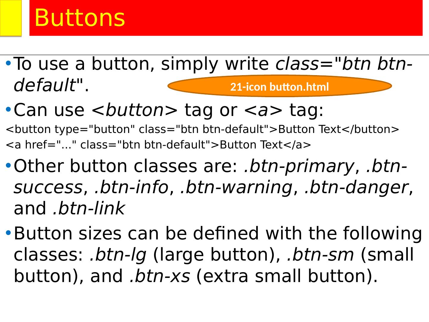
18 .To use a button, simply write class=" btn btn -default " . Can use <button> tag or <a> tag: < button type="button" class=" btn btn -default">Button Text</button > <a href ="..." class=" btn btn -default">Button Text</a > Other button classes are: . btn -primary , . btn -success , . btn -info , . btn -warning , . btn -danger , and . btn -link Button sizes can be defined with the following classes: . btn-lg (large button), . btn-sm (small button), and . btn-xs (extra small button). Buttons 21-icon button.html
19 .<div class="container"> <div class="row"> <div class="col-md-8 text-center"> < br /> <div class=" btn -group"> <input class=" btn " type="submit" value="Save" /> <button class=" btn btn -danger">Delete</button> <a href ="#" class=" btn btn -primary">Update</a> </div> </div> <div class="col-md-4"> </div> </div> </div> Styling buttons See: 15-buttons.html
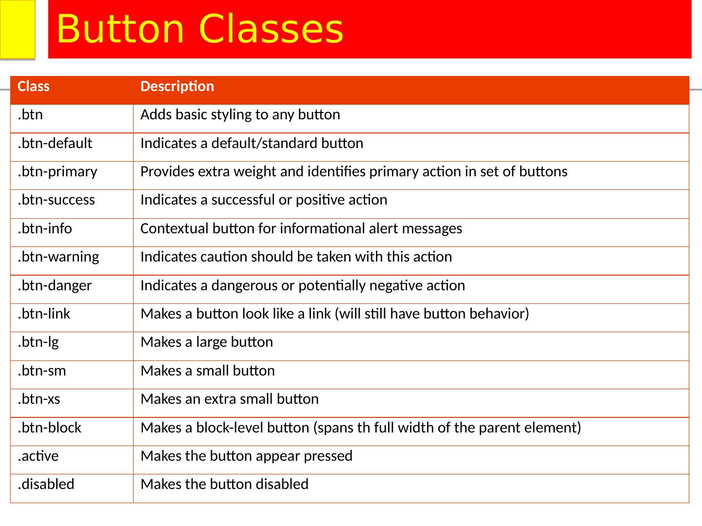
20 .Class Description . btn Adds basic styling to any button . btn -default Indicates a default/standard button . btn -primary Provides extra weight and identifies primary action in set of buttons . btn -success Indicates a successful or positive action . btn -info Contextual button for informational alert messages . btn -warning Indicates caution should be taken with this action . btn -danger Indicates a dangerous or potentially negative action . btn -link Makes a button look like a link (will still have button behavior) . btn-lg Makes a large button . btn-sm Makes a small button . btn-xs Makes an extra small button . btn -block Makes a block-level button (spans th full width of the parent element) .active Makes the button appear pressed .disabled Makes the button disabled Button Classes
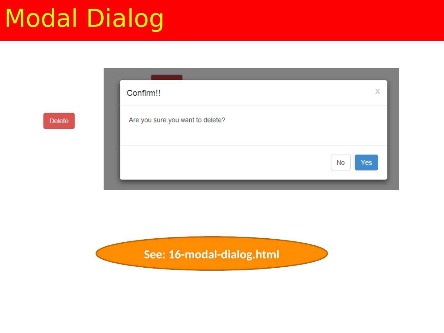
21 .Modal Dialog See: 16-modal-dialog.html
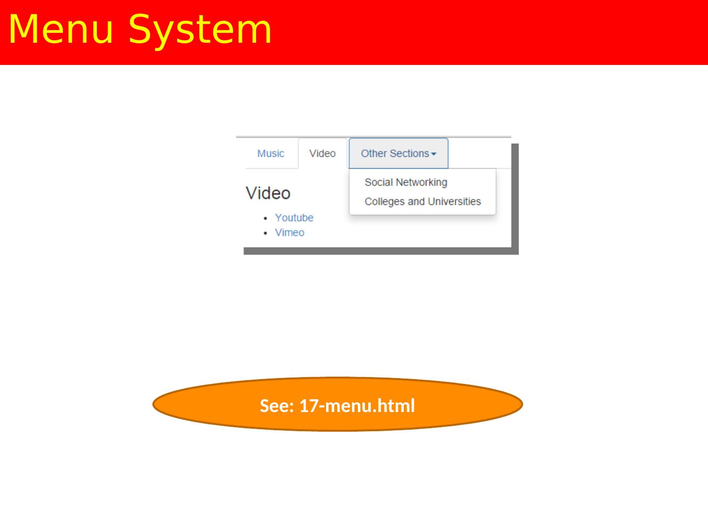
22 .Menu System See: 17-menu.html
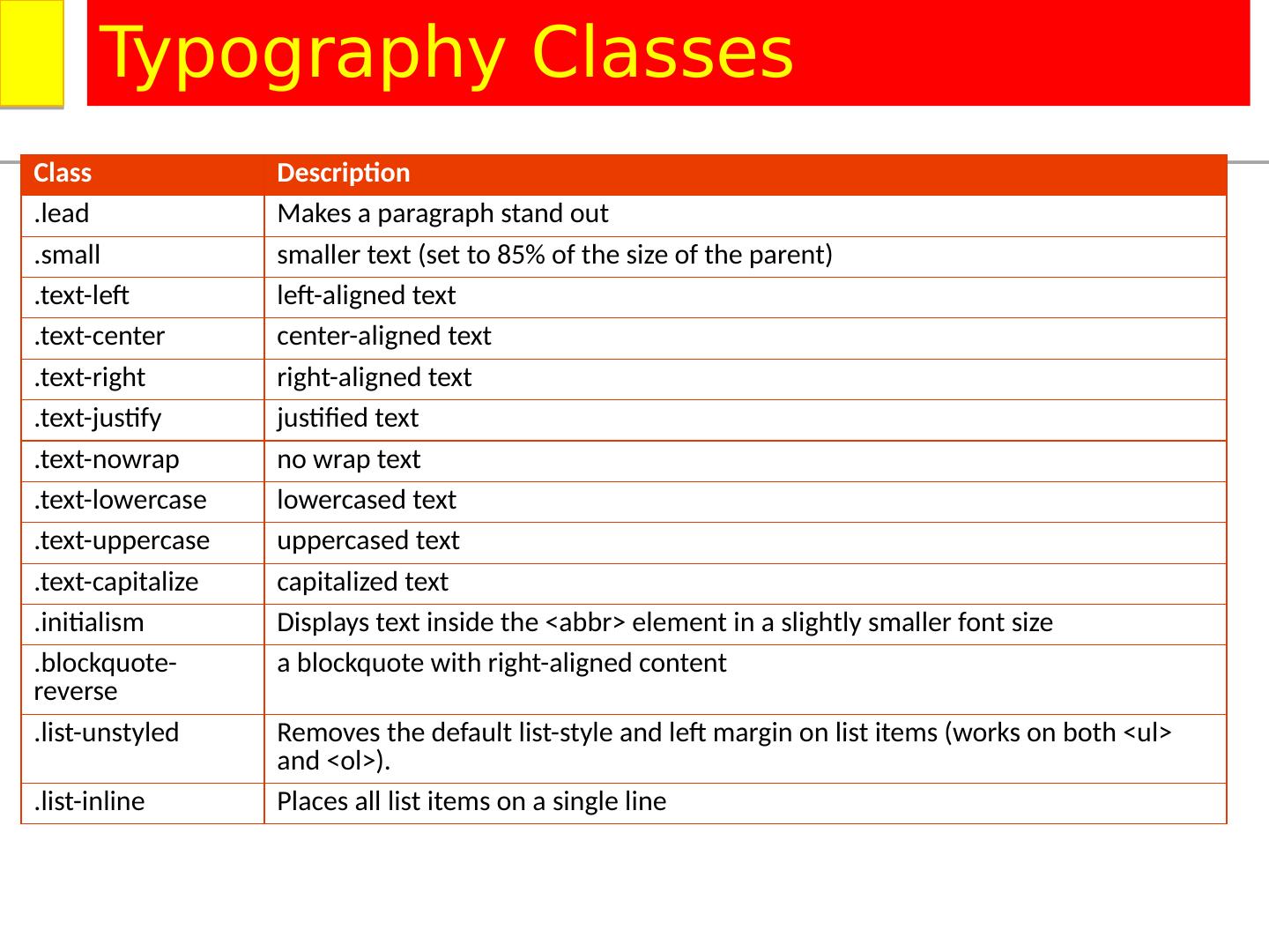
23 .Class Description .lead Makes a paragraph stand out .small smaller text (set to 85% of the size of the parent) .text-left left-aligned text .text-center center-aligned text .text-right right-aligned text .text-justify justified text .text- nowrap no wrap text .text-lowercase lowercased text .text-uppercase uppercased text .text-capitalize capitalized text . initialism Displays text inside the < abbr > element in a slightly smaller font size . blockquote -reverse a blockquote with right-aligned content .list- unstyled Removes the default list-style and left margin on list items (works on both < ul > and < ol >). .list-inline Places all list items on a single line Typography Classes
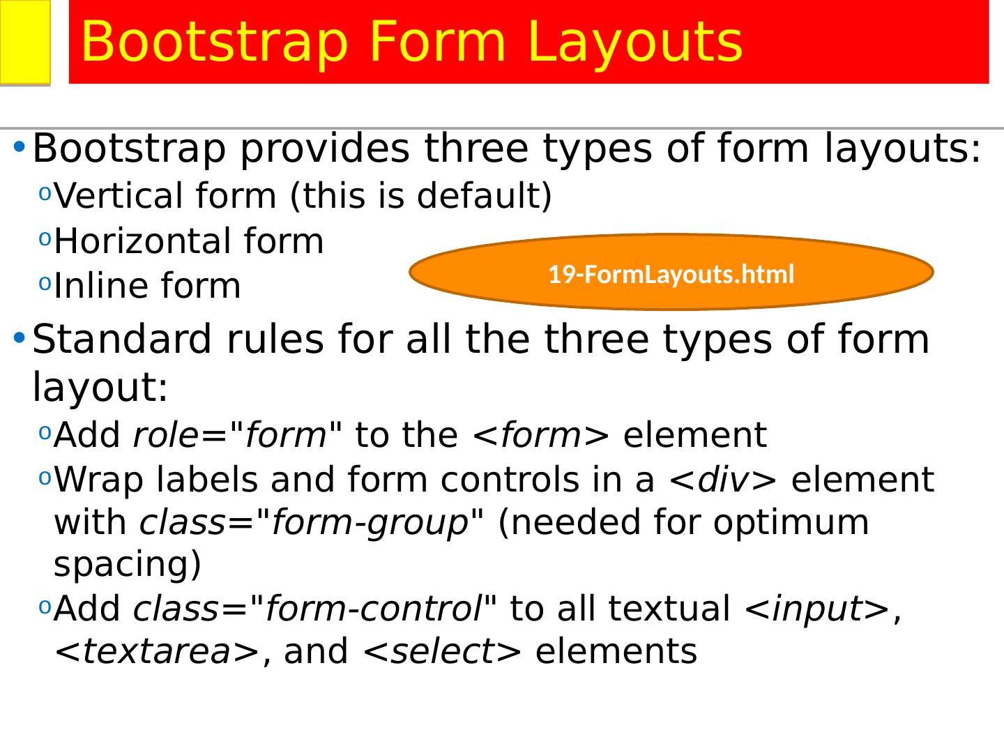
24 .Bootstrap provides three types of form layouts : Vertical form (this is default ) Horizontal form Inline form Standard rules for all the three types of form layout : Add role="form" to the <form> element Wrap labels and form controls in a <div> element with class="form-group" (needed for optimum spacing ) Add class="form-control" to all textual <input> , < textarea > , and <select> elements Bootstrap Form Layouts 19-FormLayouts.html
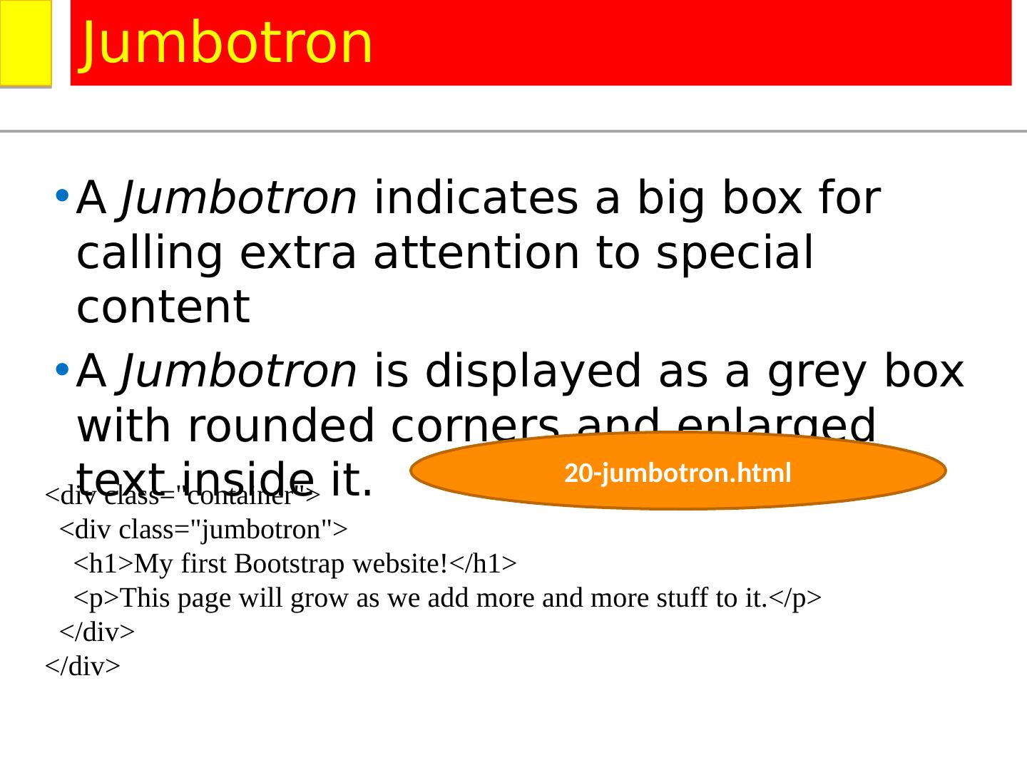
25 .A Jumbotron indicates a big box for calling extra attention to special content A Jumbotron is displayed as a grey box with rounded corners and enlarged text inside it. Jumbotron <div class="container"> <div class=" jumbotron "> <h1>My first Bootstrap website!</h1> <p>This page will grow as we add more and more stuff to it.</ p> </div> </div> 20-jumbotron.html
26 .Class Description . img -rounded Adds rounded corners to an image (not available in IE8) . img -circle Shapes the image to a circle (not available in IE8) . img -thumbnail Shapes the image to a thumbnail . img -responsive Makes an image responsive (will scale nicely to the parent element) < img > classes Example: < img src ="cinqueterre.jpg" class=" img -responsive" alt="Cinque Terre">
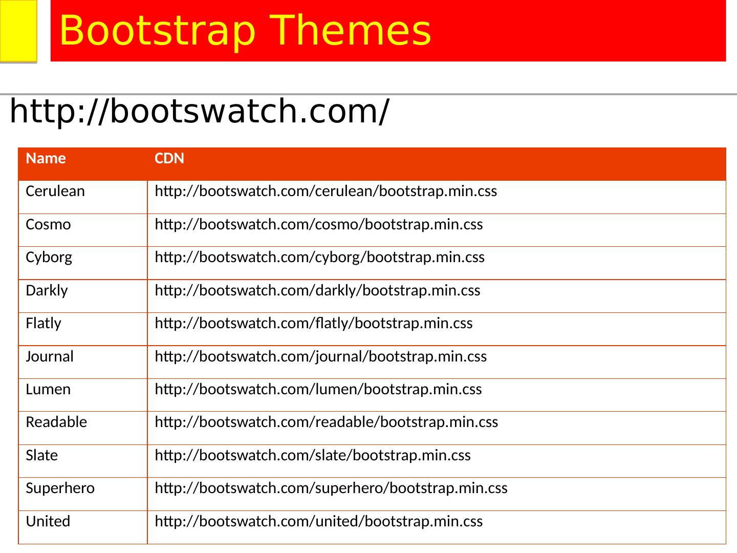
27 .http://bootswatch.com/ Bootstrap Themes Name CDN Cerulean http://bootswatch.com/cerulean/bootstrap.min.css Cosmo http://bootswatch.com/cosmo/bootstrap.min.css Cyborg http://bootswatch.com/cyborg/bootstrap.min.css Darkly http://bootswatch.com/darkly/bootstrap.min.css Flatly http://bootswatch.com/flatly/bootstrap.min.css Journal http://bootswatch.com/journal/bootstrap.min.css Lumen http://bootswatch.com/lumen/bootstrap.min.css Readable http://bootswatch.com/readable/bootstrap.min.css Slate http://bootswatch.com/slate/bootstrap.min.css Superhero http://bootswatch.com/superhero/bootstrap.min.css United http://bootswatch.com/united/bootstrap.min.css
相关推荐
3秒后跳转登录页面
去登陆

