- 快召唤伙伴们来围观吧
- 微博 QQ QQ空间 贴吧
- 文档嵌入链接
- 复制
- 微信扫一扫分享
- 已成功复制到剪贴板
Bootstrap简要介绍
展开查看详情
1 .A gentle introduction to Bootstrap TDAP Jeremy Shafer Department of MIS Fox School of Business Temple University Spring 2016 1
2 .Warning!! This material was originally prepared as an “optional topic” for MIS3502. If you want more after today, see : http://www.w3schools.com/bootstrap / Let’s start by understanding what it is we’re trying to do… Slide 2
3 .We live in a world full of devices… Slide 3
4 .An overview of Flexible Grid Layout It’ really not as complicated as this. Slide 4
5 . Flexible Grid Layout (1) The term “Grid Layout” has its origins in graphic layouts for the printed page. Web developers adopted the concepts and terminology of the grid layout, and adapted it to the dimensions of common devices So, a 800 x 600 resolution screen might be sliced into ten, 80 pixel, columns. For now we only concern ourselves with the width of our display, as vertical scrolling is acceptable to most users. A flexible grid layout is one of the three principles of Responsive Web Design. Slide 5
6 . Flexible Grid Layout ( 2 ) Slide 6 100px 100px 100px 100px 100px 100px 100px 100px 100px 100px 100px 100px 100px 100px
7 . Flexible Grid Layout ( 3 ) Slide 7 100px 100px 100px 100px 100px 100px 100px 100px
8 . Flexible Grid Layout (4) Of course 800x600 is ancient. A more common resolution screen size would be 1024 x 768. Oh no! 1024 is an unwieldy number. Designers identified 960 pixels, with margin on the left and right, as an ideal width to work with conceptually. Slide 8
9 . 960 pixels (1 of 2) Why 960? Well, it is close to 1024, and it has a lot of factors . 960px is divisible by 1, 2, 3, 4, 5, 6, 8, 10, 12 , 15, and 16 Also , 1024 x 768 was the most common resolution for many years and designers were forced to design for the lowest common denominator. Slide 9
10 . 960 pixels (2 of 2) Slide 10 80px 80px 80px 80px 80px 80px 80px 80px 80px 80px 80px 80px
11 . Making it Flexible ( 1 of 3) If we specify our layout in specific pixel widths, then we have a very inflexible layout. We have a layout that is designed for one specific screen size. That’s not practical any more. So, we begin the process of making our grid and flexible grid. We do that by expressing fonts and widths in relative terms. Specifically, percentages and units of em . Slide 11
12 . Making it Flexible (2 of 3) Slide 12 8.333% 8.333% 8.333% 8.333% 8.333% 8.333% 8.333% 8.333% 8.333% 8.333% 8.333% 8.333%
13 . Making it Flexible (3 of 3) What just happened there? We replaced absolute pixel references with percentages. We calculate our percentages as follows: (Item width px ) / (Item container px ) If you’re doing this manually, it’s a good idea to document your reasoning in your css file. Like this: width: 8.33333% /* 80px / 960px */ Slide 13
14 .So… what’s Bootstrap? Bootstrap is a framework. A framework is often nothing more than a collection of existing technologies, bundled together in a new, novel, and consistent way. In today’s class we’ll be using Bootstrap 3, the latest major version of this framework. So…. to be more precise…. Bootstrap is a CSS framework. Bootstrap is free to use and Open Source. It was developed by Twitter (and it is still maintained by Twitter.) Arguably, Bootstrap is more popular than Twitter itself. Slide 14
15 .Where to begin… What do I need in the HTML head tag? Bootstrap’s flexible grid layout Conventions for styling text Bootstrap themes Slide 15
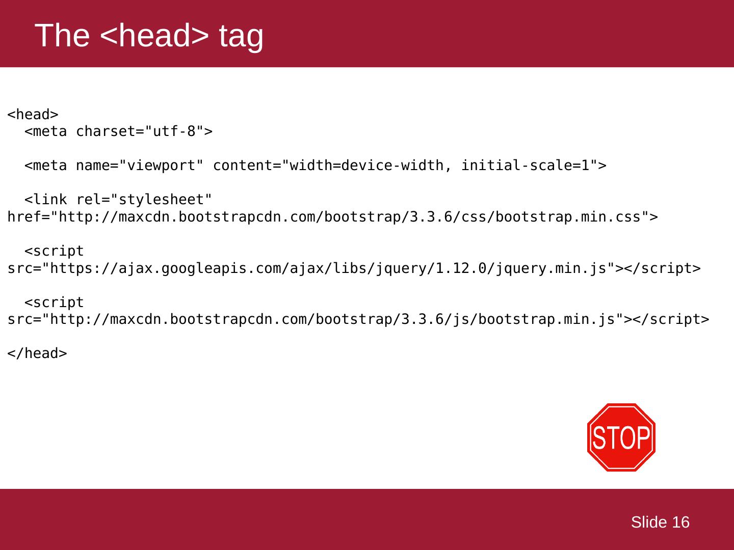
16 .The <head> tag Slide 16 < head> <meta charset="utf-8"> <meta name="viewport" content="width=device-width, initial-scale=1"> <link rel ="stylesheet" href ="http://maxcdn.bootstrapcdn.com/bootstrap/3.3.6/ css /bootstrap.min.css"> <script src ="https://ajax.googleapis.com/ajax/libs/ jquery /1.12.0/jquery.min.js"></script> <script src ="http://maxcdn.bootstrapcdn.com/bootstrap/3.3.6/ js /bootstrap.min.js"></script> </ head>
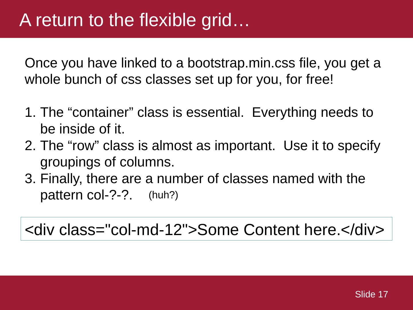
17 .A return to the flexible grid… Slide 17 Once you have linked to a bootstrap.min.css file, you get a whole bunch of css classes set up for you, for free! The “container” class is essential. Everything needs to be inside of it. The “row” class is almost as important. Use it to specify groupings of columns. Finally, there are a number of classes named with the pattern col-?-?. <div class=" col-md-12">Some Content here.</ div> (huh?)
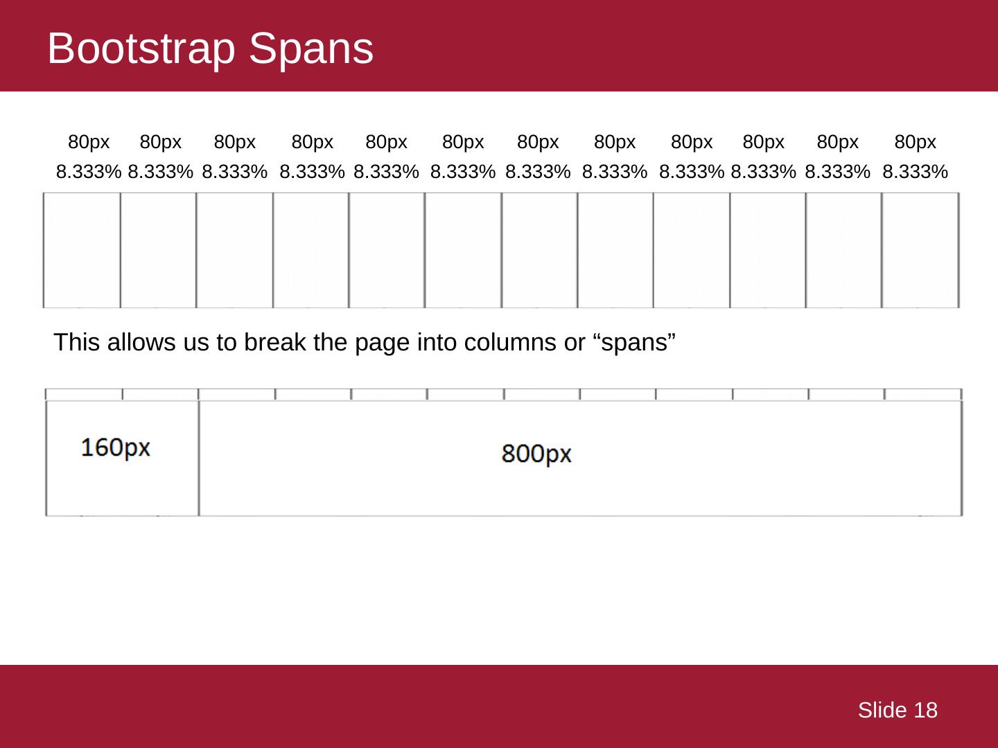
18 .Bootstrap Spans Slide 18 8.333% 8.333% 8.333% 8.333% 8.333% 8.333% 8.333% 8.333% 8.333% 8.333% 8.333% 8.333% 80px 80px 80px 80px 80px 80px 80px 80px 80px 80px 80px 80px This allows us to break the page into columns or “spans”
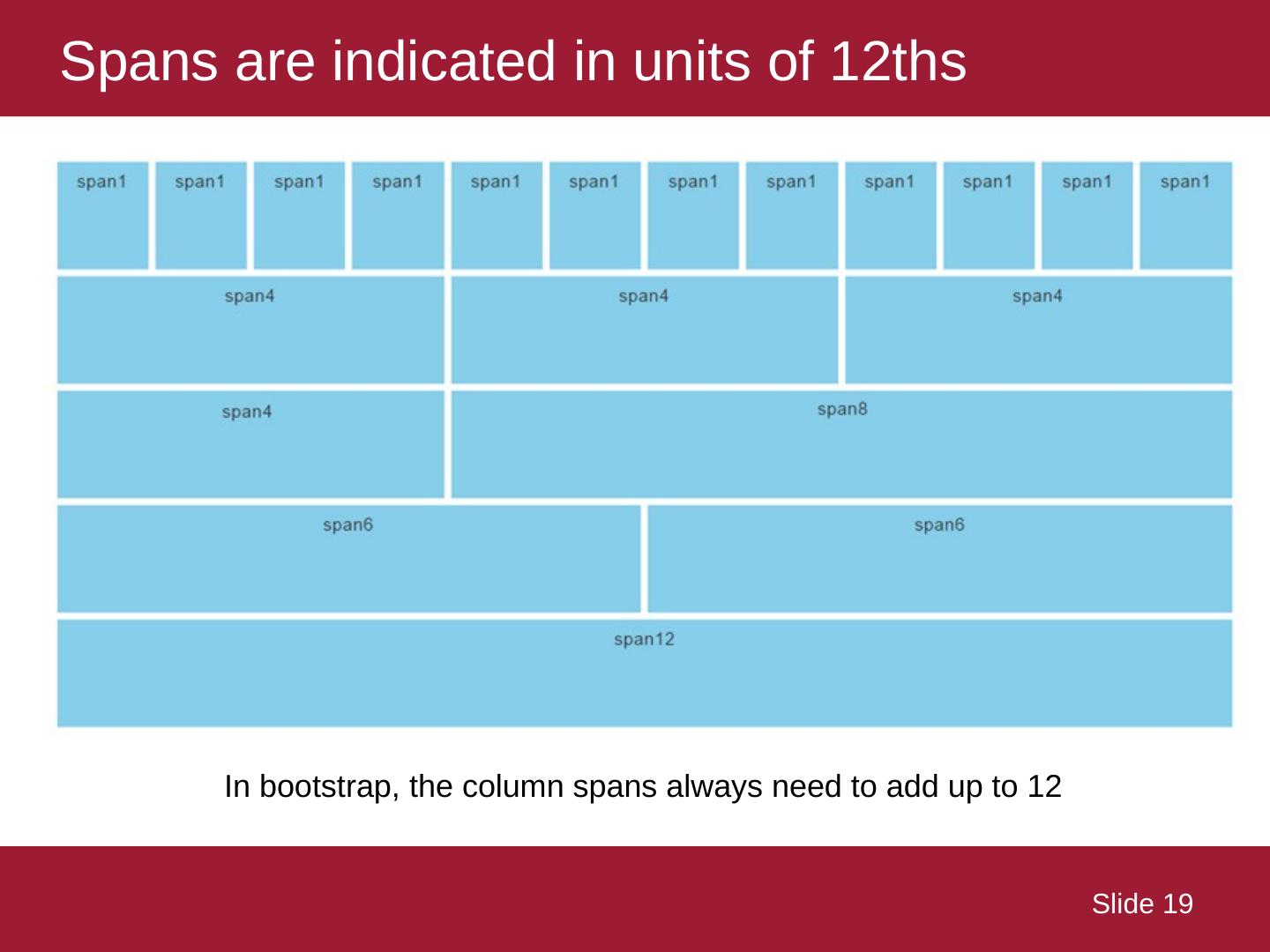
19 .Spans are indicated in units of 12ths Slide 19 In bootstrap, the column spans always need to add up to 12
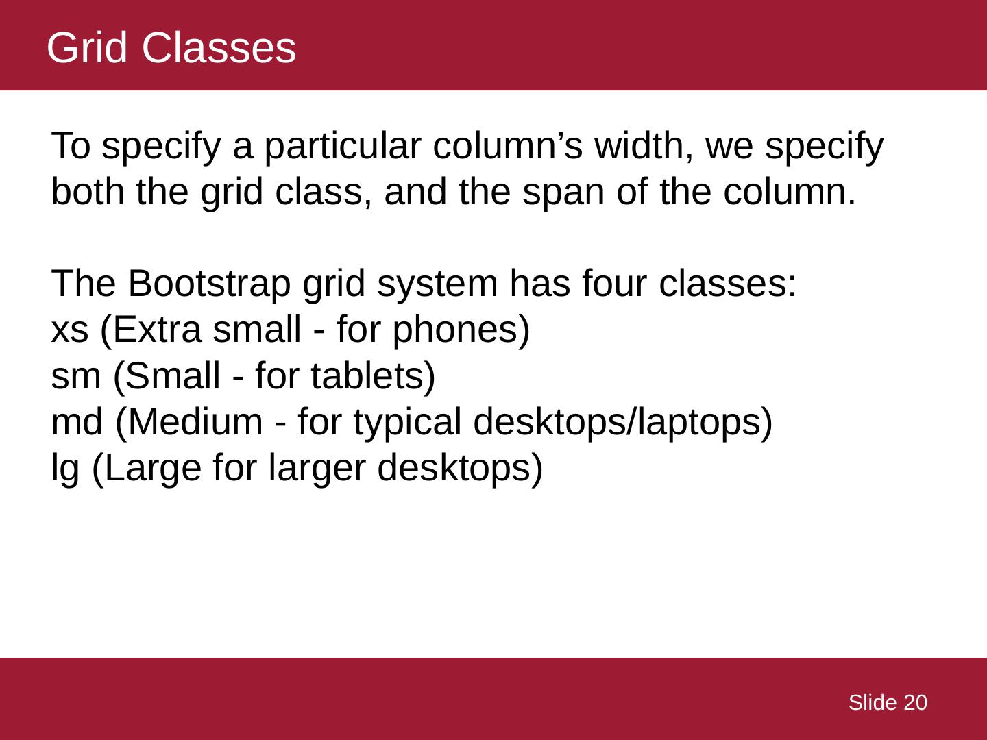
20 .Grid Classes Slide 20 To specify a particular column’s width, we specify both the grid class, and the span of the column. The Bootstrap grid system has four classes: xs (Extra small - for phones) sm (Small - for tablets) md (Medium - for typical desktops/laptops) lg (Large for larger desktops)
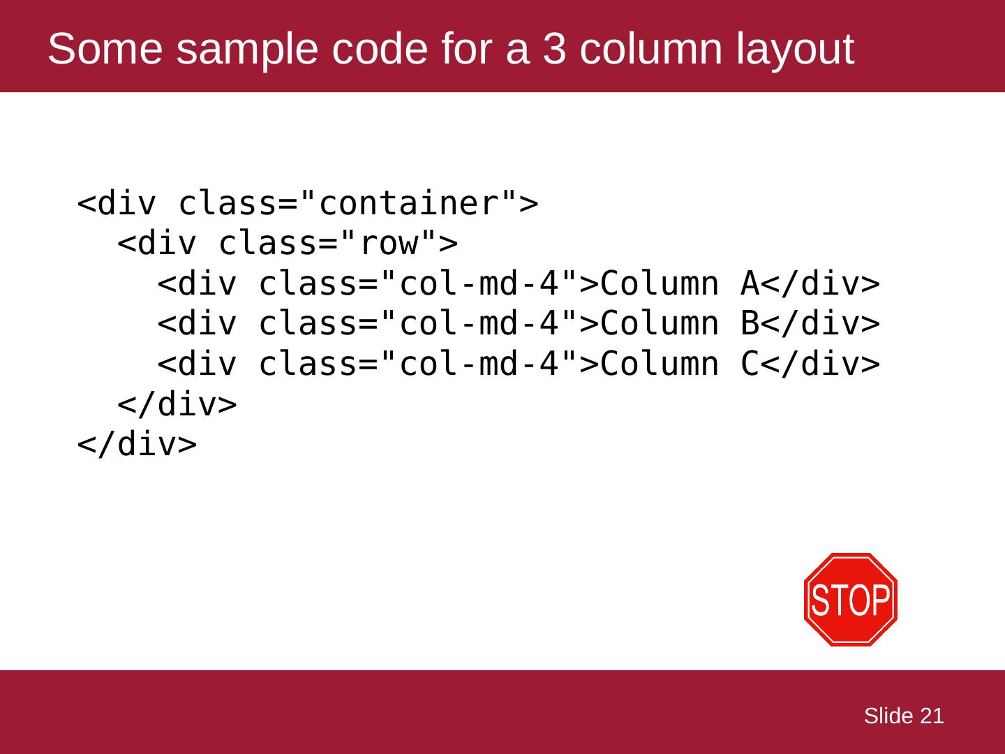
21 .Some sample code for a 3 column layout Slide 21 <div class="container"> < div class="row"> <div class=" col-md-4">Column A</ div> <div class=" col-md-4">Column B</ div> <div class=" col-md-4">Column C</ div> </div> </div>
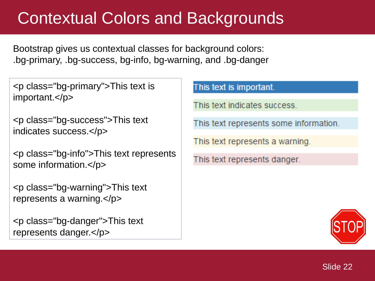
22 .Contextual Colors and Backgrounds Slide 22 Bootstrap gives us contextual classes for background colors: . bg -primary, . bg -success, bg -info, bg -warning, and . bg -danger <p class=" bg -primary">This text is important.</p > <p class=" bg -success">This text indicates success.</p> < p class=" bg -info">This text represents some information.</p> < p class=" bg -warning">This text represents a warning.</p> < p class=" bg -danger">This text represents danger.</p>
23 .Bootstrap themes Slide 23 Many developers / designers have adapted the bootstrap framework, making their own themes. You can see some free themes out on https:// bootswatch.com We can replace the link to bootstrap.min.js with a theme that we download to our web site or application.
24 .Bootstrap – it’s a place to start… Slide 24


